We have collected examples of the best logos companies, and not entirely successful. We will tell you why they have become so, and what they can teach us. But before we get started, here are a few important things about the company's logos and business. These basic principles will help you navigate the value of a logo to an organization's business, its relationship to success, and the cost of logo development:
The success of the company as a whole does not depend on the quality and thoughtful design. Any other sign would have been in place of the Apple logo,would the company be less successful? Hardly.
By itself, no one needs a logo. What matters is how and where you use it. Successful organizations use the logo at all points of contact with the customer. In this way, customers have an ongoing association with the company's products and the experiences they gain by interacting with the company.
- Profitable successful business/ high-quality expensive design - excellent!
- Profitable successful business / bad cheap design - bad!
- Unstable unprofitable business / high-quality expensive design - terrible!
- Unstable unprofitable business / bad cheap design - bad!
- A young business / inexpensive logo is fine!
So now it's time to move on from general principles To concrete examples. Let's start with samples, you can familiarize yourself with them in the next section of the article.
The best logos of firms and companies
We have selected for you the most striking examples of high-quality logos that have helped a number of companies become global leaders in their industries. These include brands such as:
General Electric
The logo of General Electric, one of the leading manufacturers of equipment, has remained virtually unchanged since the company was founded in 1892.
And why was it necessary to change it? The 'GE' initials, written in intricate script and framed by arcuate strokes, combine simplicity and efficiency - exactly the qualities that consumers expect from General Electric products. What's more, the emblem, built around an art nouveau ornament, is reminiscent of the spinning drum of a washing machine, one of the company's most popular products.
JPMorgan Chase
JPMorgan Chase is one of the leading financial conglomerates and the largest bank with an asset value of an astonishing $2.35 trillion.
Moreover, JPMorgan Chase is ranked sixth in the ranking of the largest open joint-stock companies in the world. In other words, it is a brand that speaks for itself.
Admittedly, the bank managed to accurately convey its dominant position with the help of the logo.
What makes the JPMorgan Chase logo recognizable and effective?
With a simple, bold typeface and minimal use of graphics, the JPMorgan Chase emblem conveys power and authority, as if to say, "If you don't pay on time, we'll charge you more late fees than you ever dreamed possible." Harsh, right? But one should not expect another attitude from such a serious organization.
If you are at least a little familiar with, then you do not need to explain what Facebook is.

Notably, Mark Zuckerberg's company was originally called The Facebook. But the article in the name did not last long, and the company itself made a real revolution in the Internet community, rapidly becoming the most popular social platform in the world.
The Facebook logo has the most valuable quality in graphic design - it allows you to instantly identify a brand. Taking care of maintaining a recognizable visual image, the company made only minor stylistic changes to its logo, leaving the main elements intact.
ExxonMobil
ExxonMobil is the largest oil company in the world, which brings astronomical profits to its owners and shareholders. Exxon and Mobil were once two different firms that decided to pool their knowledge and resources in 1998 (perhaps with the ambitious goal of establishing world domination).

Such a successful and reputable organization should have an appropriate logo! But in this case, as they say, something went wrong. The ExxonMobil logo, with its simple, uninteresting design, fails to capture the character of such a powerful brand.

Unfortunately, the logos of individual companies before their merger often look more distinctive and original than the emblem of the merged company.
What conclusion can be drawn from this story? Less is not always better.
I think millions of people will subscribe to my words if I say: “THANK YOU, AMAZON!”. Thanks to the Amazon Prime service, I can order absolutely anything and receive it within 48 hours (or even faster). And all this with free (well, almost free) shipping.

Knowing your own strengths, the online store masterfully reflected them in its emblem. See the arrow that stretches from A to Z? Symbolizing directional traffic, the arrow indicates that Amazon will deliver your order from its warehouse directly to your door. But that's not all the meanings contained in this simple icon. The arrow also resembles a smile, indicating that the company guarantees a high quality of service, making sure that its customers are satisfied.
Microsoft
Despite some gaffes that have accumulated over the past few years (yes, Zune and Windows 10, we are talking about you!), with the redesign of its logo in 2012, Microsoft did an excellent job.

The logo, which lasted from 1987 to 2012, was pretty good (I especially liked the O, which looked like Pac-Man), but left a lot to be desired in terms of design.
In terms of color, the new emblem looks much friendlier. And the one who came up with the idea to present the main products of the company in the form of four square windows is a real genius! The blue window symbolizes the Windows operating system, the red one represents the Office software suite, the green one represents the Xbox game console, and the yellow ... Yellow does not mean anything, but since the window cannot have three panels, we will assume that it is necessary.
And it's also worth noting that of all the companies on this list, Microsoft has the most trouble building a sustainable visual identity. Judge for yourself: every time the computer giant makes changes to its logo, it looks completely new, as if it has nothing to do with the company's previous logos.
Nike is known not only for its sports shoes, but also for one of the best logos in the business world. The iconic Nike swoosh serves a prime example that a visual identity can play a huge role in establishing a reputation and transforming an ordinary company into a reliable, respected brand. If the Nike emblem was not considered something remarkable before, over time it has become a visual identification of sports culture.

In English-speaking countries, Nike's "swoosh" is known as the "swoosh". "Swoosh" is the sound we hear when an object rushes past us. Thus, this word denotes a sharp sound, speed and movement, which is successfully reflected in the curved shape of the logo.
The history of the Nike check mark is notable because it demonstrates the development of the logo from the “ugly duckling”, which no one liked before the “beautiful swan”, which attracts admiring glances.
The "parents" of the legendary BMW logo are the round Rapp-Motor emblem with a black silhouette of a horse and the Bavarian flag with its characteristic blue and white checkerboard pattern. This is how the familiar black circle appeared, inside which blue and white quadrants are located.

After the First World War, which ended with the Peace of Versailles, the company switched from aircraft production to the production of motorcycles and cars. The BMW emblem has remained virtually unchanged since 1917. The most noticeable transformation took place in 2000, when the logo gained volume due to the 3D effect.
mastercard
Back in 1966, Mastercard was known as Master Charge, and its first logo featured two intersecting circles (bright orange and yellowish red) with the words "Master Charge: The Interbank Card".
![]()
In 1979, the company shortened its name to the capacious MasterCard. New name - updated logo! The colors on the emblem have become brighter, and the font has become more solid. In 1996, the logo became voluminous: now "slits" appeared in the area where the two circles intersect.
FedEx
In 1971 on the logo postal service housed the full name of the company "Federal Express", located at an angle.
![]()
The emblem was made in patriotic red and blue colors, which evoked associations with the American government. Having gained popularity due to its original logo, the brand decided to say goodbye to it in 1994. The new design was as inventive as the old one: an arrow is hidden between the letters E and X, which indicates speed and accuracy as the main advantages. postal company.
The first IBM logo was created in 1924 when Computing-Tabulating-Recording was renamed International Business Machines.

So the company's name acquired a more modern sound, and the 1924 logo became an updated version of the 1911 emblem, which was previously used by CTR. The sophisticated CTR logo, with its airy, ornate typeface, gave way to a cumbersome "International Business Machines" lettering (with an emphasis on the word "International"), which was placed inside a circle symbolizing the globe. In 1947, when the brand carried out a significant modernization of its technologies, the round emblem was replaced by the abbreviation "IBM", which was destined to become a symbol of the company. In 1956, graphic designer Paul Rand redrawn the letters, making them black and more massive. The new design emphasized the brand's qualities of stability and resilience. In 1972, Rand was commissioned to rework the look he had created. To create a dynamic and flexible image, the designer made "slots" on the abbreviation. This is how the famous "striped" emblem turned out, which IBM is pleased with to this day.
Despite the external diversity of all the above signs, they were all designed according to similar criteria, which made them so successful. These are the factors we will discuss next.
What can you learn from these logos?
What conclusions can an entrepreneur draw from reading the stories behind these logos?
Decide what your logo should communicate about the brand
The emblem should reflect the essence of your brand, emphasizing its most characteristic features. For example, looking at the logo of JPMorgan Chase, you immediately understand that we are talking about an influential company with a reputation that has been developed over the years. How does your logo characterize your business?
By the way, the majority of entrepreneurs, to one degree or another, FOR the correspondence of the logo to the business area, and only 16% do not consider such a requirement to be mandatory when creating a logo.

Don't be afraid to impress
Too pretentious, extravagant design is something that should be avoided at all costs. But at the same time, one should not be afraid to use the logo in order to boldly declare oneself and indicate one's place in the market.
Create a simple logo
This tip is a bit of a contradiction to the previous tip, but it's important to keep things simple and light when creating a logo. This concerns the number of colors used, the readability of the font, the number of elements. Look at the Nike logo for a perfect example of a simple yet effective logo.
Find a good concept and stick to it
Many companies (Apple, Johnson & Johnson, General Electric) do not change the logo once chosen for decades (and in the case of J&J, even more than a century!). But even while making seemingly significant changes to their emblems, such brands remain true to their previous design concept.
While it's never a bad idea to rethink your corporate style, try to find the designs that best describe your brand and use them as your guide. Buyers get used to the emblem, and over time they begin to strongly associate it with the company. Consistency in the development of the visual image will provide your brand with wide recognition in the long run.
Ready for another dose of inspiration? Then let's admire the ones that once again prove that graphic design is separate view art.
Examples of beautifully designed company logos
Most logos carry some kind of message (for example, information about the quality of services provided by the company). We have collected dozens of corporate emblems that deserve to be called examples of highly professional graphic design. Share your opinions in the comments! What emblems made the strongest impression on you?


Which logo suits you?
If a high-quality but inexpensive logo is what you are looking for, then go to online service Logaster and design your logo in just a few minutes.
A logo is essentially a visual representation of a company. Think of the golden arches of Macdonald's or the swoosh of Nike - these impressive logos have embodied two of the largest empires under their banners. However, many companies still skimp on developing this key part of building the corporate ideal. A good memorable logo significantly increases the growth and loyalty of customers, forms the right impression with business partners,
There are 3 types of logos:
- Repeating infinity elements. For example, the fundamental power of the logos of IBM, Microsoft and Sony is created by intersecting elements, which makes the symbols of firms distinctive.
- There are logos that literally illustrate what a company produces or provides, for example, painting houses often use an illustration of a brush or paints in a logo.
- Use of abstract graphic symbols. An example is Nike. Over time, the image of the brand name has become for consumers a reminder of the company in any situation.
Consider the most popular logos famous brands clothes and shoes.
Nike
The logo of the well-known company is represented by the popular signature Swoosh, which identifies the wing of the Greek goddess Victoria (the Greek name Victoria means “victory”). The logo project was launched in 1971 by Caroline Davidson, a graphic designer and student at the University of Oregon. This project was suggested to Caroline by Philip Knight, one of the founders of the company. Knight didn't particularly like Caroline's suggestion, but he was confident that the logo would work for him in the future. And, as we see, he was not mistaken in the calculations. Later, as the Nike brand rose to international heights, Phillip presented Davidson with a Swoosh diamond ring as a token of his gratitude and great amount sportswear and footwear from the corporate warehouse.
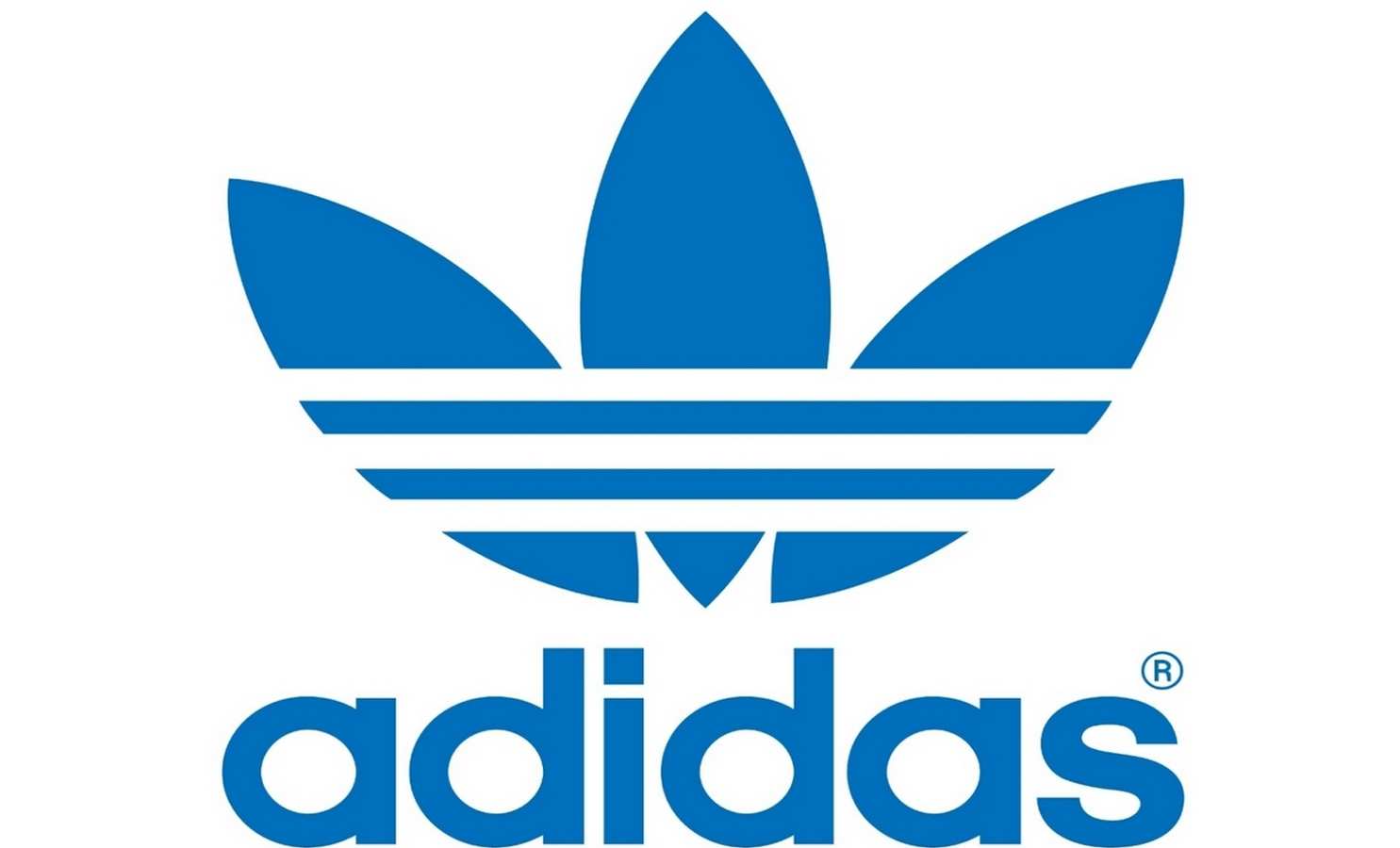
Adidas
The Adidas brand was created after the collapse of his father's company, which was called Gebrüder Dassler Schuhfabrik. Initially, the name of the company sounded like Addas - an abbreviation of the initial letters of the name of the founder of the company. However, a few months later, Addas was changed to Adidas (the founder was called Adi among friends).
The signature three stripes featured on the logo were acquired from the Finnish sports company Karhu in 1950, and today it is the style of the firm that is included in the most popular logos of famous brands. By the way, the stripes symbolized the popularity of the company on three continents.

Puma
Rudolf Dassler, brother of Adolf Dassler, in turn, founded the Puma brand. The first version of the company's logo differs from the one we know now - the original name of the company sounded like "Ruda" (from the name of the founder of Rudolf, Rudoo). According to one version, the first version of the logo was designed by Rudolf himself, and in the 60s of the 20th century. the symbol acquired the familiar outlines of Puma.

Gucci
The Gucci company is the brainchild of Guccio Gucci, who laid the foundations of the now famous brand in 1921 in Florence. One of his six children and became the designer of the famous logo in 1933. Today, the Gucci symbol is chicly included in the logos of famous clothing and footwear brands, as it occupies one of the first places in terms of recognition.
A feature of the symbol was the overlapping letters G. However, these are not only letters, this is a symbol of two stirrups - the legacy of the Guccio Gucci brand, which sold accessories for horses.

Givenchy
Givenchy- fashion brand founded in 1952 by Hubert James Marcel Tuffin de Givenchy. Today, the company also produces perfumes, clothing and jewelry. The logos of famous brands have been replenished with another popular symbol of the fashion house.
The logo design is quite simple, but attractive and mesmerizing at the same time. It is a four "G", occupying the entire area. The Givenchy logo is reminiscent of ornate Celtic jewelry.

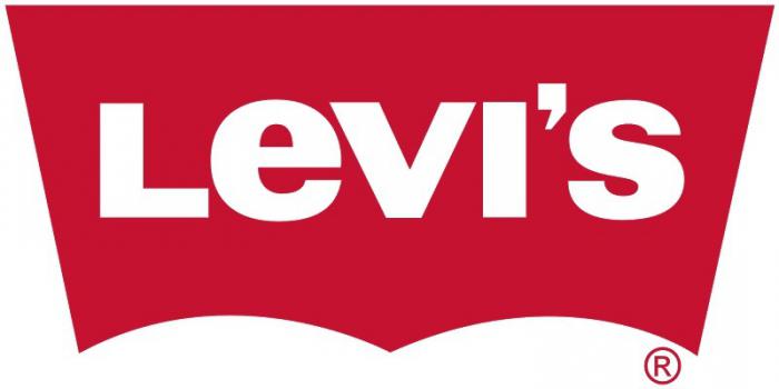
Levi Strauss & Co
Levi Strauss & Co. (LS & CO) was founded in 1853 when Levi Strauss moved from Franconia to San Francisco to promote the West Coast branch of his brothers' haberdashery business. Already in the 1870s, the company launched mass sales of denim overalls, which were successfully dispersed among buyers.
It is worth noting that jeans in the form that is known to the modern man in the street began to be produced only after 1920. It is noteworthy that the original logo of the company appeared in 1886 and was a two horses tearing jeans into different parts. Logos famous history their creations, as a rule, are overgrown with legends. Thus, the appearance of the LS & CO logo was preceded by a story that became an indicator of the quality of the product: the driver tied two separate cars with jeans and drove in this way to the destination station.
Reebok
The company was founded in England in 1895 by Foster and his sons thanks to the founder's desire to provide his sons' sneakers with spikes. After climbing the Olympus of global manufacturers already in 1958, the founder's grandsons, Joe and Jeff, renamed the company Reebok. The name refers us to the African continent, where "rhebok" is a type of antelope. The logos of world famous brands Reebok and Adidas now belong to a single fashion house - Reebok has been a subsidiary of Adidas since 2005.

Louis Vuitton
The Louis Vuitton fashion house was opened in 1854, after which the whole world learned about the goods highest quality and chic. The company's logo is represented by the brand's initials and is designed as a stylization inspired by Japanese floral motifs.
hello kitty
The character itself was invented and brought to the public in 1974 by Shintaro Tsuji, the owner of Sanrio. As a trade logo for the company, the image of Cute Kitty was registered in 1976.
Initially, there were two names between which there was a choice: Hello Kitty and Kitty White. Nevertheless, the first name turned out to be more attractive, and the character himself became the idol of millions of children and their parents around the world. Logos famous companies and brands of children's clothing and toys, previously separate, made a single powerful breakthrough in the business.

Converse
The history of the company, like its logo, dates back to 1908 and is called the Converse Rubber Shoe Company. In 1915, the founder of Mills Converse began making tennis shoes, but a life-changing event for the firm happened in 1917: basketball player Charles H. Taylor walked into Mills' office with an injured leg. To facilitate the movement of the athlete, Mills developed high-top sneakers, which today have already become classics in the global fashion shoe industry.
Converse is not just a brand, it is a whole era, for example, it was in this shoe that Wilt Chamberlain scored 100 points in an NBA game in 1962, Converse also wore it when he scored the decisive goal in 1982. It was the official shoe of the NBA for a long time, worn by sports legends such as Larry Bird and Julius Irving.
Since 2012, the equally popular Nike company has become the owner of this brand.

Lacoste
One of the oldest and most respected brands, whose logo is a green alligator, is known to everyone who at least once was interested in the fashion world. In 1933, Jean Rene Lacoste created a company that produced tennis shirts, and the name was formed from consonance with the founder's sports pseudonym, which sounded like "crocodile skin".
The symbol of the company Rene Lacoste was born, as well as many other logos of famous brands. The game was worth the candle in this case. The history of the creation of the symbol is as follows: one of Rene's friends drew little crocodile just for fun, but it soon became the logo of the brand that is now known to everyone.

Fendi
The company's logo is often compared to a puzzle: these thoughts are prompted by two letters F inverted relative to each other. The founder of the brand is the popular designer Karl Lagerfeld, who invented the logo for the fashion house of the married couple Eduard and Adele Fendi. The recognizable symbol of the fashion house is now emblazoned on every document signed by Fendi representatives as a fashion seal of Fendi collections.

Chanel
The famous back-to-back double "C" logo was first seen in the fashion world in 1925 on a bottle of Chanel No. 5 perfume.
The logos of the most famous brands often have several stories of their creation, and this happened with the Chanel brand. One of the versions tells about Mikhail Vrubel, who in 1886 depicted horseshoes that resembled the current Chanel logo. Another version says that Vrubel did not take any part in creating the symbol, but simply used two crossed horseshoes as a symbol of success and luck. Nevertheless, most designers are sure that the logo represents the initials of Coco Chanel, the founder of the French fashion house.

Calvin Klein
On November 19, 1942, the Calvin Klein brand was created, the logo of which became available to the public only 30 years later. The light and memorable SK logo easily evoked associations about the brand, so it was made on the pocket of each pair of trousers. Soon, the popular symbol began to be used not only as a mark of the manufacturing company, but also as a collectible stamp.

Versace
Symbol famous brand symbolically linked to Greek mythology and featuring the intertwined snake heads that often adorn bag logos. There are quite a few well-known brands, but the Versace logo is difficult to confuse with another company.

The logo was designed in 1978 by Gianni Versachi, who was obsessed with the classics in art, so the option with turning the audience to stone became a symbol that embodied the designer's fatal attraction to the fashion world.
Each of us sees these logos every day, but not everyone understands what secret meaning lies in them.
So, it's time to expose the logos that flash before our eyes every day!
If you think that the logo of the Korean titan Hyundai symbolizes the first letter of its name, then you are deeply mistaken! H is a symbolic image of a client and a customer shaking hands.
Who hasn't heard of the Adidas brand? It was formed in honor of its founder - Adolf Dassler. The logo was endlessly changed, leaving only one element intact - the three stripes. The modern logo is depicted in the form of a mountain. This is a symbol of the obstacles that every athlete will certainly face.
Renowned designer Rob Yanov, who worked on the Apple logo, purchased a bag of apples and drew them in a frenzy, trying to keep the shapes as simple as possible. A piece of apple was bitten off as an experiment. Oddly enough, the word byte is translated as a bite. What a coincidence!

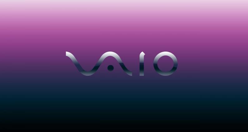
Sony Vaio - the owner of an outstanding logo. Its first two letters are a wave that represents an analog signal, the last two letters symbolize a digital signal.
There is nothing supernatural about the Amazon logo. The yellow bright arrow is the customer's smile, because Amazon employees wish their customers happiness. A smile arrow combines two letters A and Z. This suggests that you can buy everything on the portal - from A to Z!

Baskin Robbins has a bright and appetizing logo. If you look closely at the pink part of the picture, you can see the number 31. This is the number of flavors of ice cream that customers can try.

Many people believe that the Toyota logo is a stylized head of a cowboy wearing a hat. But everything is much more complicated. In fact, it depicts the eye of a needle and a thread threaded through it. The thing is that before the company was engaged in looms. There is one more subtle nuance - if you put all the elements of the logo together, you will get the name of the company.

Continental manufactures car tires. One of them became the two capital letters of the logo. If you look closely, you can see the drawing of the wheel in perspective.

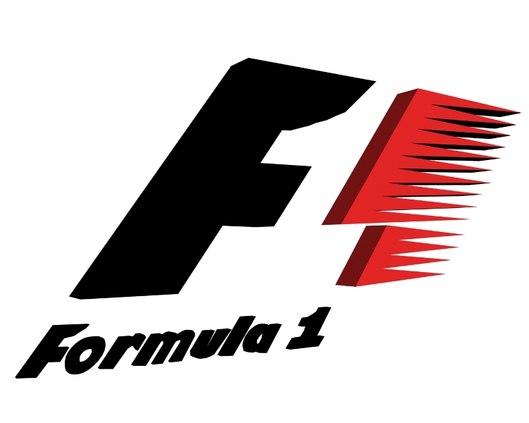
The Formula 1 logo literally screams about speed. An attentive viewer will notice the number 1 between the letter F and the red stripes.
love to watch interesting video videos and attach them to your online whiteboard? The inventors of Pinterest propose to “pin” videos using a virtual needle, which is the letter P in the logo.

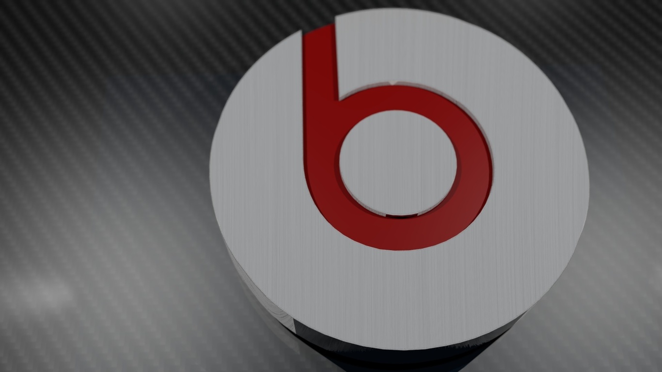
It's hard to believe, but Beats deciphers its logo as a music lover in headphones. The logo contains two elements - the letter B and a red circle ... Simple and incomprehensible!
Toblerone is a well-known global manufacturer of delicious chocolate. This brand is inextricably linked with the city of bears Bern. That is why the Toblerone logo depicts a bear standing on its hind legs.

BMW began its history in the aviation industry, so the logo says so. Some believe that in the center of the logo is a moving propeller with blades. But no, it's very simple, it's just a part of the Bavarian flag.

In the center of the LG logo is a smiling man. Because the company's employees treat their customers like human beings, which they want to emphasize. Some skeptics believe that the company logo is based on the character of the Pac-Man game.

Evernote employees believe that some animals do not remember information worse than people. That is why they put the logo of an elephant on their logo, which has a slightly bent ear, like paper. With such an elephant - a note from Evernote, the user will not forget anything!

The hidden meaning of the Coca-Cola company is amazing! To boost sales in Denmark, they placed the Danish flag between the O and L.
Every day a person comes across hundreds of logos. They are so familiar that few people think what they mean. But in fact, even the simplest logos often take months and millions of dollars to create, and almost every one of them has some subtext. In our review of 10 famous logos with a decoding of their meaning.
1. Fedex

The logo of an American logistics company consists of 2 parts: the inscription "Fed" in purple and "Ex" in orange. It seems to be nothing special, so why did such a modest logo win dozens of awards? The answer is simple - the space between the letters "Ex" forms an arrow, which on a subconscious level is associated with the speed and professionalism of the company.
2. McDonald's

Most people think that the logo of a restaurant chain fast food McDonalds is nothing more than the first letter of the company's name painted in golden color. However, fans of Freud's theory argue that this form of the letter evokes associations with a nursing mother's breast.
3. Museum of London

The Museum of London is dedicated to the history of this city from the time of its founding to the present day. In 2010, the museum management decided to update its image in order to become more attractive to a younger audience. New logo It was made in bright colors and is sure to attract attention. At first glance, the new logo immediately presents a map of London. And each of the colored contours is the boundaries of the city limits of the British capital in different historical eras.
4. Adidas

The name of the famous manufacturer of sportswear and accessories arose from a combination of the first and last name of its founder, Adolf Dassler. Over the 66 years of the company's existence, its logo has changed several times, but it has always had three stripes. Today, the logo has three slanted stripes in the shape of a triangle, which symbolizes the mountain. This metaphor means conquering new peaks.
5.Mitsubishi

Mitsubishi was founded in 1873 as a result of the merger of two shipbuilding companies. The company's logo appeared by combining the coats of arms of its creators - the three-leaf crest of the Tosa clan and three diamonds of the Iwasaki family. The three diamonds symbolize reliability, integrity and success, while the red represents trust and attracts customers to the brand.
7. Google

The Google logo looks very simple - just a regular inscription, the letters in which have different colors. In fact, when creating the Google logo, the designers wanted to capture a sense of the company's "rebellious spirit". The secret of the logo lies in the colors of the letters: the primary colors (blue, yellow and orange) are suddenly interrupted by a green letter that is out of the scheme. So Google decided to highlight its non-standard and unwillingness to play by the rules.
7. Animal Planet

Previously, the Animal Planet logo featured an elephant stretching its trunk towards a miniature Earth. However, in 2008 the channel was rebranded in order to increase its appeal to a wide audience. The channel had to get rid of long and boring documentaries and move on to captivating reports. The new logo, as Animal Planet explained, should represent instincts, the jungle and primal emotions. Quite a lot of emotion for an emblem that had one letter upside down.
8. NBC

It's no secret that the NBC logo symbolizes a peacock, but few people know why this is so. It was actually a marketing gimmick to get people to buy color TVs. At the time the logo was created, NBC was owned by the electronics company Radio Corporation of America (RCA). RCA wanted to show the public that the relatively high price of a TV was entirely due to the ability to view pictures in color.
9. Amazon
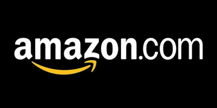
At first glance, the Amazon.com logo is very simple - the name is in bold black with a curved yellow arrow underneath. But what does this arrow symbolize? First, it represents the smile of a satisfied customer. And secondly, the yellow arrow goes from the letter "A" (the first letter in the Latin alphabet) to the letter "Z" (the last letter of the alphabet), which symbolizes the diversity of Amazon products.
10. Pepsi

The Pepsi logo is a simple circle with the top half red and the bottom half blue, with a wavy white line between them. At first glance, these are the colors of the American flag. But in fact, Pepsi has spent hundreds of millions on its current logo. The branding agency that designed the logo for Pepsi released a 27-page report outlining the many meanings behind the logo. It symbolizes the Earth's magnetic field, feng shui, Pythagoras, geodynamics, probability theory, and more.